£0.00


We are sure you have a perfectly designed business card. But, there are times where somewhere along the way, errors can occur. Have you ever experienced a situation where you thought your design was perfect, but when you had it printed it was not what you expected? This could have most likely been avoided when the file was first created.
Here are the common mistakes that can happen when creating your file for printing… and what to do to prevent them.
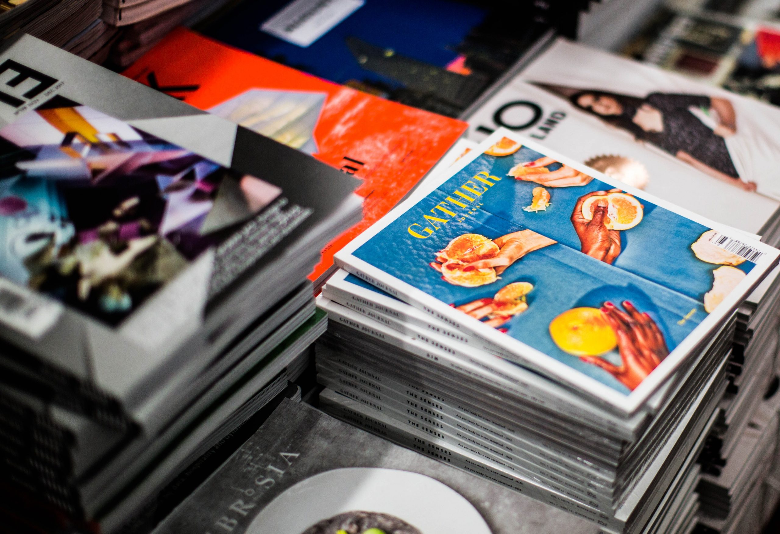
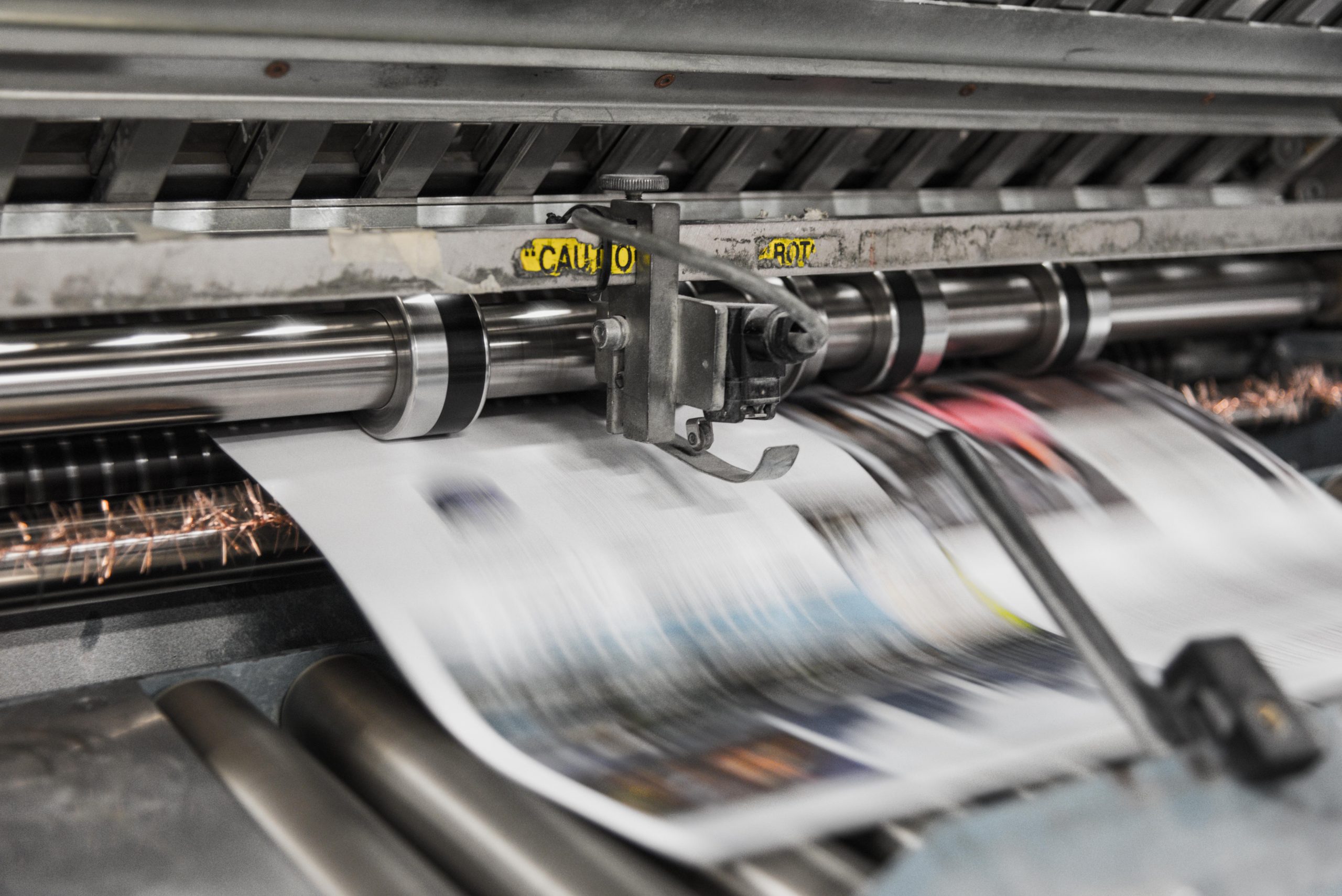
Printing
No Bleed
Guillotines are becoming more precise in cutting your artwork to its desired size; however, it is still possible that the machine could be off by a millimetre or two. In order to ensure that your artwork is exactly the right size, you should add bleed to your artwork. or you might end up with a White border on your finished product.
It’s important to have enough room around the work area to ensure the paper doesn’t move while printing or being cut down, so that the print looks professional.
Add 3mm of bleed to your artwork whilst creating the file.
Going Beyond the Safe Zone
There is a very small possibility of the paper shifting in the cutting machine. The blade can cut out the outside of the markings, but it can also cut inside of the markings as well.
When you are using your computer for typing or drawing, create a safe area of 5mm, as there is a chance that your print could be cut. Be sure to place images and texts inside that safe margin.
Off-Centre Borders
Don’t use intricate borders toward the very edge of your design! When cutting the trim lines if the blade slips a couple of mm there is a risk of the borders looking out of place.
How to avoid: When drawing borders in your artwork, make sure that they do not extend beyond the edge of your safe area. Otherwise, they might be trimmed in to
during the cutting process. This means that there might be a thin white line when the border is cut off.
Imagery
Printing in RGB
When you print a flyer or postcard, do you find that the colours in the printed copy sometimes don’t match the colours on the screen? You might be printing your document in RGB colour mode.
If you are printing artwork or documents using the RGB colour mode, they should match the colours on your computer screen. However, you may find that certain colours cannot be created using the CMYK colour mode.
Always make sure your color mode is set to CMYK.
Low Resolution
If the design has to have a high resolution, it has to have clear and sharp text, images, and graphics. Designs with low resolution usually end up looking blurry and grainy.
Avoid using artwork or photos that have a resolution of 300dpi; you should use artwork or photos that have a resolution of 150dpi instead.
High Ink Coverage
When the images printed require too much ink, they will cause the paper to wrinkle. There is a limit to how much ink can be absorbed by the paper.
Using a preflight tool is one way to avoid printing your artwork too heavily. There are tools designed to reduce ink coverage, if available.
Text
Small Text
Text that is smaller than 6-point font size can be difficult to read. This is because small text is hard to read and can appear blurry.
How to avoid: Don’t set your smallest text to at least 6 pt in size. Doing so will make the text illegible. If the font has thin strokes, increase the font size to boost visibility.
Missing Fonts
If you want to use fonts that are not recognized by your local printer or print shop, you should make sure the software is installed correctly. This will prevent your computer from substituting fonts.
How to avoid: If you plan on creating any images from your text, it’s important to rasterize or convert your text to a Smart Object in Photoshop. If you are using Illustrator, convert your text to outlines.
Spacing
The look of a document when it’s sent through a printer isn’t always pretty; however, extra space between lines of text or uneven margins can be very unattractive when printed.
It’s important to always make a rough draft of a project so you know what it will look like once it’s finished.
Spelling & Grammar
It’s important to correct errors that go to print.
Avoid: proofread, proofread, proofread. If spelling isn’t your strength, ask a friend or colleague to help you proofread your work. Using spell check on your computer is helpful, but be careful – spell check isn’t fool proof.
There are ways to prevent errors when printing artwork; however, it’s best to check it twice before sending it to a print shop or online printer.
If you need any more advice on getting your designs ready for printing, don’t hesitate to contact us!